Onderò
Improving conversion from discovery to booking by reducing friction in navigation and complex planning flows.

My role:
Product Designer
Scope:
Discovery & Research • UX • UI • Design System
Business model:
B2C, Mobile, Web
Timeline:
2023-2025
Context
Ondero is a unified travel platform that brings together discovery, trip planning, travel guides, and booking into a single, connected experience—enabling meaningful interactions between travelers and content creators.
My role focused on continuously improving the user experience, refining existing flows, and designing new features to support the platform’s evolving product vision.




Problem
Users struggled with a disjointed travel planning experience. High drop-offs occurred because the journey from inspiration to booking felt fragmented and difficult to navigate.
Research
& Insights
To pinpoint friction, we combined behavioral analytics, usability testing, and qualitative feedback across the core journey—from onboarding to trip management, booking, and itinerary planning—revealing issues with navigation clarity, service fragmentation, and unnecessary steps.
68%
of users failed to complete the onboarding
65%
of users save travel ideas but don’t turn them into bookings
80%
use at least three different apps to organize a single trip.
70%
discover trips on social media but lose the track of them.
Approach
Our strategy was to bridge the gap between a rigid client vision and the technical limitations of third-party integrations. Since the booking logic was fixed, we focused on the pre-booking experience where we had the most room to influence user behavior
Simplifying the Journey: we focused on organizing the "messy" parts of travel planning into a logical flow that leads users naturally toward taking action.
Collaborating on Trade-offs: I worked closely with the team to negotiate which user needs were non-negotiable and where we had to adapt due to system constraints.
Solution
& Impact
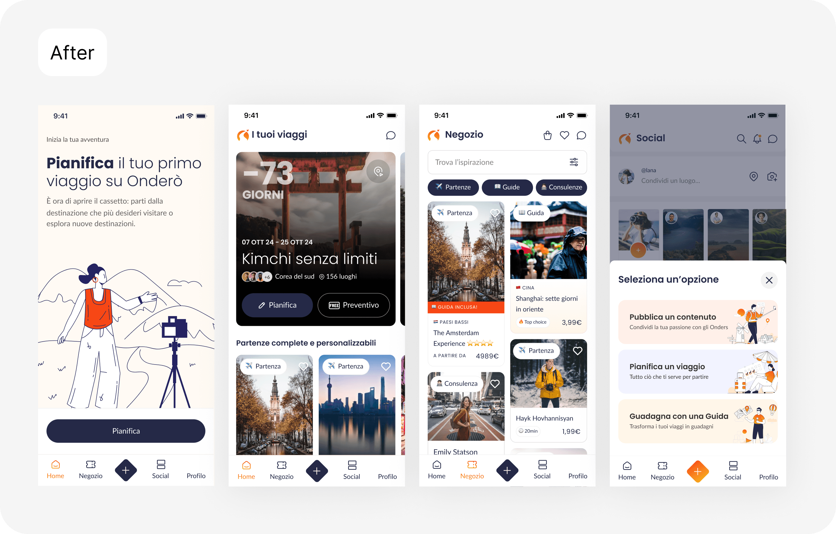
We simplified the core experience consolidating key actions into “+” entry point and restructuring home bar introducing a Marketplace section. Elevating content creation into a single, static action reduced decision friction and improved usability at a glance.
Opitmized onboarding
82%
succes rate
Onboarding now guides users with fewer steps, visual icons, and clearly grouped categories for faster, easier setup.


Improving main navigation to drive trip booking and clarity
70%
succes rate
Reduced cognitive overload on the Home screen by removing endless action lists and moving key actions to a CTA—improving prioritization, and task initiation.
By grouping Trips, Consultancies, and Guides within a dedicated marketplace, content discoverability and wayfinding were improved.

Learnings
This project deepened my ability to design within technical limitations and rapidly shifting product environments. Key impact on me:
Managing Trade-offs: I learned to navigate moments where technical constraints and changing requirements forced compromises on user needs, requiring me to prioritize the most critical paths for the product's survival.
Constraint-Driven Design: Adapted UX solutions around external third-party systems, ensuring a functional experience despite non-negotiable technical boundaries.
Resilience & Adaptability: Developed the ability to pivot design strategies quickly as project realities evolved, maintaining alignment between stakeholder goals and feasible user outcomes.
tell me about your project
2025 © — Made by Svetlana Hovhannisyan on Figma + Framer
thanks for stopping by ^^